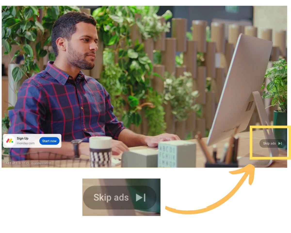
Popular video-sharing app YouTube is currently engaged in another exciting experiment and that includes a new and improved Skip Ads feature.
The button is outlined to be smaller in text, features a curved border, entails a less opaque background, and also doesn’t have any capital letters in the term Ads too.
The company rolled out a preview of its upcoming feature that is still in the trial stage. And one of its leading spokespersons revealed how the button would be tested on all of the platforms to see what sort of a response it generates.
Moreover, the app also added how their goal right now is to put out the best user experience that’s in line with the revamped appeal. Similarly, it hoped to include a new vibe that was also announced last year but now, it seems like work is finally being done in this regard.
The reason why it’s so interesting is that users would now be less motivated to jump over ads if they were not aware of this new feature. And that would help in causing an increase in viewership, better reach, and more conversions, and also give rise to greater advertising spending through this app. But marketers need to be mindful of the fact that shoving ads into users’ faces could really have the opposite effect. After all, who likes ads in the first place?
This new and improved design was first observed by one Ads expert who gave rise to his two cents on the matter. He claims that the feature comes in the form of a skip ads button and the revamped format is quite smaller in design than what we’re usually accustomed to seeing. And whenever this gets launched, it could impact viewership and spending on such campaigns too.
On the other hand, also some people flag this new feature and put out questions against the app regarding its possibility of making ads longer in duration in the near future.
In case you’re wondering why this new button has been redesigned at this point in time, well, the answer is simple. It comes at a time when people are trying hard to get accustomed to the app’s new feel and display. Similarly, they hope such features would ensure it remains a prominent location where creators can help generate more revenue while users get the kind of content they've been in search of.
H/T: ThomasEccel / X
Read next: YouTube's Harmonious Harmony: Partnering for Responsible AI in Music

