Instagram is bringing some new features to provide users a bit fancy look. Few days back Instagram relaunched chronological order home feed upon user's demand. In addition to it, the social media platform is also testing an entire enhanced look to the app's user interface (UI).
According to the social media app analyst, Alessandro Paluzzi, Instagram is working on a tweaked interface to bring home feed to the full-screen, displaying all sorts of user posts, Instagram Reels and stories.
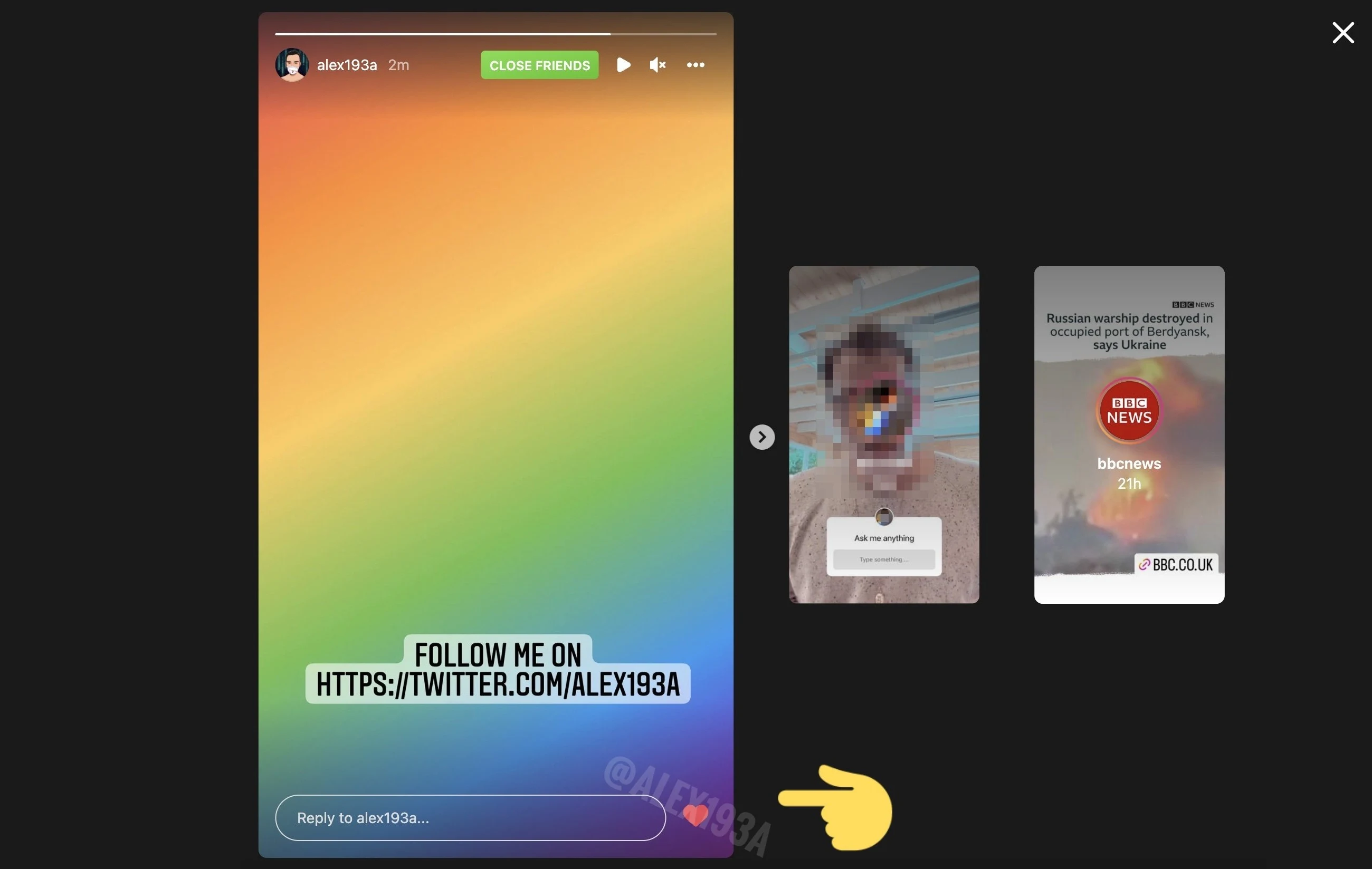
With this update, users can fully focus on the videos one at a time. Before this, users see multiple reels and content on the screen at the moment. This feature will shift stories bar from top to the bottom. Upon sliding one's story, one can see other stories as well. However, stories bar will also be there on the top of app interface but when you scroll down the feed, stories bar will become invisible at the top. Additionally, Instagram is also launching a live test of likes (heart emoji) in stories reaction on the web.
In stark contrast, we see TikTok app which is growing at high pace. TikTok's videos are displayed one by one on the screen so that users can fully engage with the content and the app showcase more relevant videos to the users based on their likes and screen time. Whereas, Meta-owned Instagram is on the way of launching this feature on UI. It is necessary to mention that TikTok is entirely a video based app. Its focus is on the video clips, which is the main reason for addiction of TikTok's feed. But, Instagram was created for the purpose of sharing photos and selfies, not the videos. Despite the fact of being a visual sharing app, Instagram's chief Adam Mosseri is now focusing on videos rather than images, and they're moving a step further in this regard by changing the presentation style of the app.
This new update is still in the development phase, and we expect to see it soon.
Read next: YouTube’s Clears Up Creator Concerns Regarding Shorts
According to the social media app analyst, Alessandro Paluzzi, Instagram is working on a tweaked interface to bring home feed to the full-screen, displaying all sorts of user posts, Instagram Reels and stories.
#Instagram is working on a full immersive feed 👀 pic.twitter.com/zTXVpH4C6n
— Alessandro Paluzzi (@alex193a) March 25, 2022
With this update, users can fully focus on the videos one at a time. Before this, users see multiple reels and content on the screen at the moment. This feature will shift stories bar from top to the bottom. Upon sliding one's story, one can see other stories as well. However, stories bar will also be there on the top of app interface but when you scroll down the feed, stories bar will become invisible at the top. Additionally, Instagram is also launching a live test of likes (heart emoji) in stories reaction on the web.
In stark contrast, we see TikTok app which is growing at high pace. TikTok's videos are displayed one by one on the screen so that users can fully engage with the content and the app showcase more relevant videos to the users based on their likes and screen time. Whereas, Meta-owned Instagram is on the way of launching this feature on UI. It is necessary to mention that TikTok is entirely a video based app. Its focus is on the video clips, which is the main reason for addiction of TikTok's feed. But, Instagram was created for the purpose of sharing photos and selfies, not the videos. Despite the fact of being a visual sharing app, Instagram's chief Adam Mosseri is now focusing on videos rather than images, and they're moving a step further in this regard by changing the presentation style of the app.
This new update is still in the development phase, and we expect to see it soon.
Read next: YouTube’s Clears Up Creator Concerns Regarding Shorts


