The main product or service that Google tends to provide is that of a search engine, and this is the most popular Google property that people tend to involve themselves in on a day to day basis. The search engine platform often makes modifications because of the fact that this is the sort of thing that could potentially end up increasing the rate of engagement that it can get for ads that brands post on its platform.
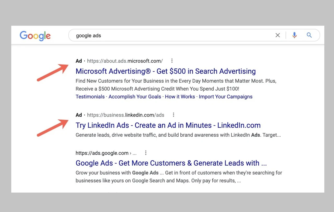
Getting more engagement is something that Google tends to prioritize quite a lot, since the more engagement its ads get the more likely it would be that people would want to try them out. Two of the most recent changes that can be seen on Google are meant to boost engagement, including one update that changes the font color of the URL in ads. The main URL is still being displayed with the dark, bold color that people might be used to, but the part that highlights that it’s an ad is being shown in a much lighter color, as spotted by Brodie Clark.

With all of that having been said and now out of the way, it is important to note that this might trick people into clicking on ads thinking that they are organic search results. That can have a harmful impact on the user experience that people can expect to enjoy, although it might turn out to be a successful experiment from Google in terms of increasing the success rate that the ads it displays can obtain.
The second change has less to do with ad click through rates because it involves the People Also Ask section being shown more than once. This section was previously shown underneath the sponsored search results and before the organic ones, but now there will be a second box with more questions. Google incorporated this feature to encourage users spending more time on their search engine, and this update has had more of a mixed response as opposed to the overwhelmingly negative one that was received by the lighter URL text for search engine ads.
Read next: Chrome Users Can Now Translate Image Text With Google Lens On Desktop
Getting more engagement is something that Google tends to prioritize quite a lot, since the more engagement its ads get the more likely it would be that people would want to try them out. Two of the most recent changes that can be seen on Google are meant to boost engagement, including one update that changes the font color of the URL in ads. The main URL is still being displayed with the dark, bold color that people might be used to, but the part that highlights that it’s an ad is being shown in a much lighter color, as spotted by Brodie Clark.

With all of that having been said and now out of the way, it is important to note that this might trick people into clicking on ads thinking that they are organic search results. That can have a harmful impact on the user experience that people can expect to enjoy, although it might turn out to be a successful experiment from Google in terms of increasing the success rate that the ads it displays can obtain.
The second change has less to do with ad click through rates because it involves the People Also Ask section being shown more than once. This section was previously shown underneath the sponsored search results and before the organic ones, but now there will be a second box with more questions. Google incorporated this feature to encourage users spending more time on their search engine, and this update has had more of a mixed response as opposed to the overwhelmingly negative one that was received by the lighter URL text for search engine ads.
Interesting. Google looks to be doubling up on the People Also Ask box on a single results page. In the examples I've seen of this test, the Qs look to all be unique and have a different focus. Potentially serving a different intent? Either way: more data for SEOs! pic.twitter.com/BjZdHahJVI
— Brodie Clark (@brodieseo) March 9, 2022
Been seeing more and more PAAs at the bottom of the SERP....
— Mordy Oberstein 🇺🇦 (@MordyOberstein) February 25, 2022
Here are two PAAs on the same SERP with one on top and one on the bottom! pic.twitter.com/dYrwj8u1a4
Read next: Chrome Users Can Now Translate Image Text With Google Lens On Desktop
