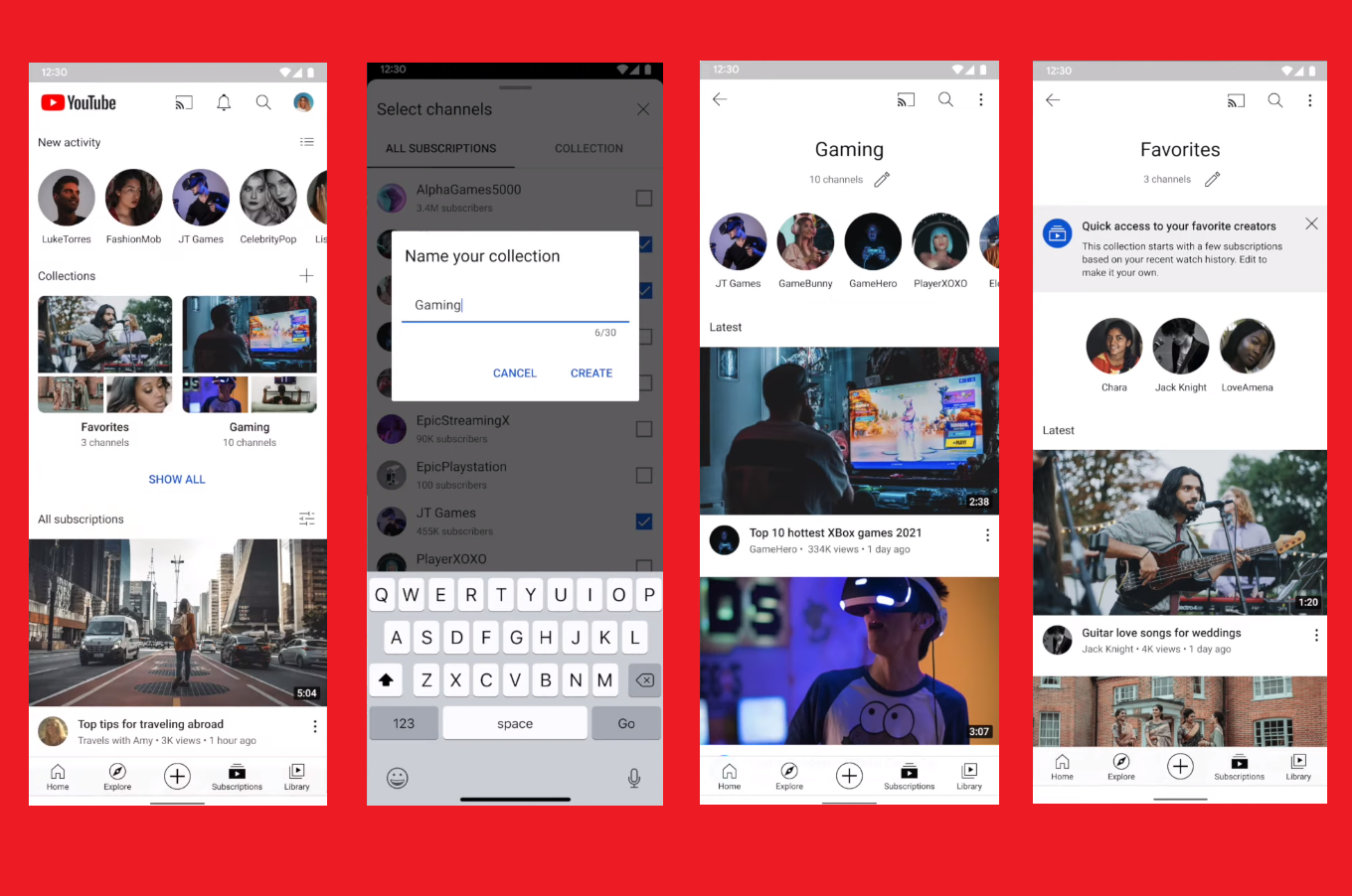
A new Creator Insider video recently published has addressed its criticized Subscriptions Feed, offering up a new feature by the name of Collections in return.
The Subscriptions Feed essentially features all the different YouTube channels that a user is subscribed to. Pretty simple concept, right? The channels are placed in a chronological order, allowing users to scroll through and find the right ones, for purposes of unsubscribing, or turning on notifications, and so on. Perhaps some user recently subscribed to a YouTuber and can’t remember their channel name, and is thus going through the Subscriptions Feed for that information. So, yeah, this is a pretty cut and dry concept that requires absolutely no elaboration, and will continue to serve perfectly for generations both current and future. End of article.
Of course, I jest, but even readers not familiar with UIs or technology as a whole may have identified the problem with this system from the get-go. With how massively popular YouTube is nowadays, and has been for quite a while, there is no way that this system was effective even as far back as 2012. People have thousands of channels they subscribe to, impulsively or otherwise, and absolutely no one has the energy to sift through so many different channels by mere scrolling. It’s an annoyance to simply imagine, really, and to think that this is the feed that users have been stuck with since the beginning is just asinine. If a Subscriptions Feed is featuring thousands of different channels for users to sort out, they might as well consider just relying on the search bar to find whatever they’re looking for instead. At least the latter provides results at the top of the page.
At any rate, it seems that YouTube has finally heard out the concerns its userbase has, and is now working on making a better UI for the Subscriptions Feed. Enter Collections from stage right. Collections is a new system via which YouTube channels can be sorted into different categories for later examination. It’s not an automatic system, and requires manual labor, but it’s still a start. Users can now assign different categories, naming them as they wish, and then sort channels into said categories accordingly. This way, users have both a cleaner Feed and more control over what it should look like. Furthermore, YouTube doesn’t have to do any of that pesky work of just assigning a basic sorting system that automatically categorizes content according to tags. Everyone wins.
Read next: YouTube all set to launch three new features which will allow creator of the channel some more access and a places mentioned feature within the description box

