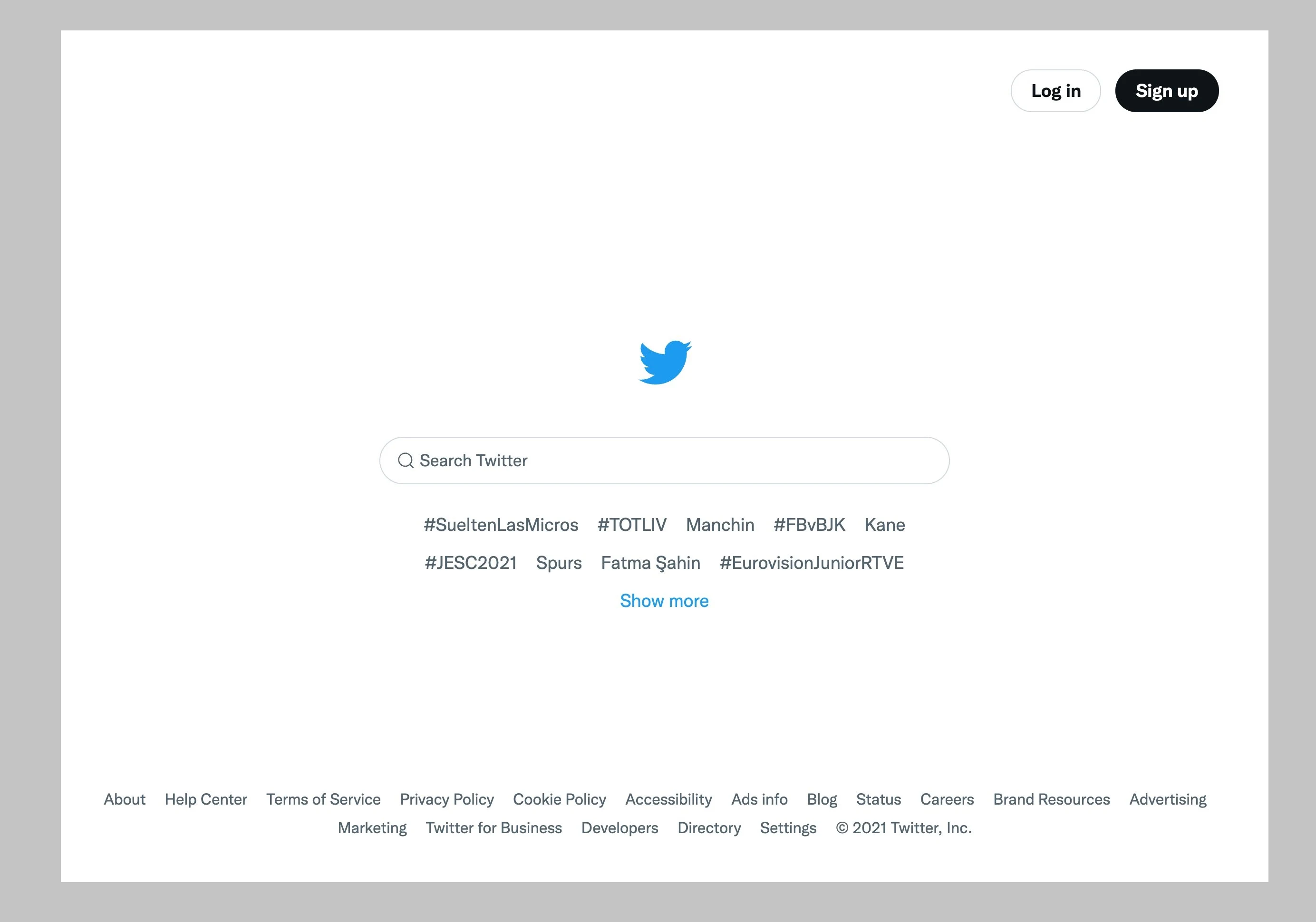
Some Tweeters seem to be getting a new version of Twitter’s startup page, and it looks very reminiscent of the Google Search webpage.
This new startup page was brought up by social media journalist, serial leaker, and all-around platform expert Jane Manchun Wong on, as you could probably guess, her Twitter account. The thread underneath her screenshot is also an interesting one, with comparisons being drawn to other platforms’ startup pages, with Wong herself commenting with mild amusement on just how similar Twitter’s new webpage looks to the Google Search engine. Really, were it not for the blue shades, I might have even confused it for Google Search. There’s a lot of empty space, a search bar in the middle, a Twitter logo on top of the bar, and a few relevant hashtags and links provided right underneath for the former and at the bottom of the webpage, for the latter. So, did Google manage to acquire Twitter, and why does Twitter even need a search bar in the first place? Let’s address some of the queries as quickly as we can.
First, let’s address the matter of why a platform such as Twitter even needs a startup page. A search bar doesn’t really seem to add all that much to a social media platform, and it’s not really a common practice that others employ. If one needs to search up posts and whatnot they, well, log in. However, with Twitter, things are a bit different. It’s status as a microblogging platform, coupled with how many tweets are often considered to be publically accessible can allow users to easily search and sift through different tweets in order to find relevant topics of discussion. It’s a platform that can actively benefit from having a search bar right at the startup page, and the relevant hashtags lying right underneath said bar can even provide netizens with direction as to what’s new and currently trending.
What’s even more important is that we’ve technically already been privy to a startup page before. It was just much busier back then. Circa 2009 Twitter had a startup page with far too much going on. There was a search bar, yes, but it was relegated to occupying the left upper side, and was a bit smaller in size. The hashtags took up much more of the screen, everything was colored blue and the Twitter logo featured was the old animated looking bird that the platform started out with.
It’s amusing to think of the startup page as a time capsule of sorts, but it does document just how far Twitter has come as a platform. Also, minimalism is dominating literally every aspect of online media, and I genuinely think it’s for the worse. Ugh.
Read next: Twitter’s Super Follows Feature Has Become A Money Maker For The Platform, Raking In Hundreds Of Thousands Of Dollars Per Month

