In the increasingly competitive business environment, companies focusing on the bottom-line tend to debate the significance of investing in various aspects of the business. As the use of the internet as a marketing and business platform increases, website designs have been suggested as an ideal way of attracting and retaining clients. The need for sound investment means that companies must develop a business case for investing in website design. When asked whether a credible and compelling website really matters, various marketing professionals have undertaken studies to provide proof. Much of the evidence discussed in the article points towards the fact that a well-built website generates enhanced customer traffic while an improved user interface enhances conversion. In this article, we look at the business case for investing in website design and offer recommendations on some do’s and don’ts. The five crucial elements that every web designer should consider when designing a website and which impact the business bottom-line include:
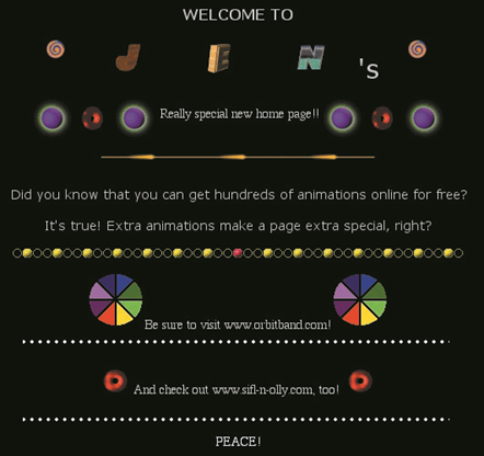
Figure 1: An example of a page with too much animation.

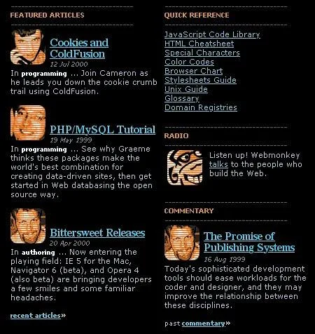
You should also take the time to proofread and revise the content of your site. Proofreading is particularly important because typos and grammar errors affect your business and website badly. Use more visual weight such as color, space, and size to highlight important elements and appealingly structure your information as shown by the example in figure 2. This will allow your readers to comprehend the content just by glancing at the page, thus speeding up the process of finding what the reader needs.
Figure 2: Example from a past Webmonkey page that effectively uses treatments to express the structure of the information

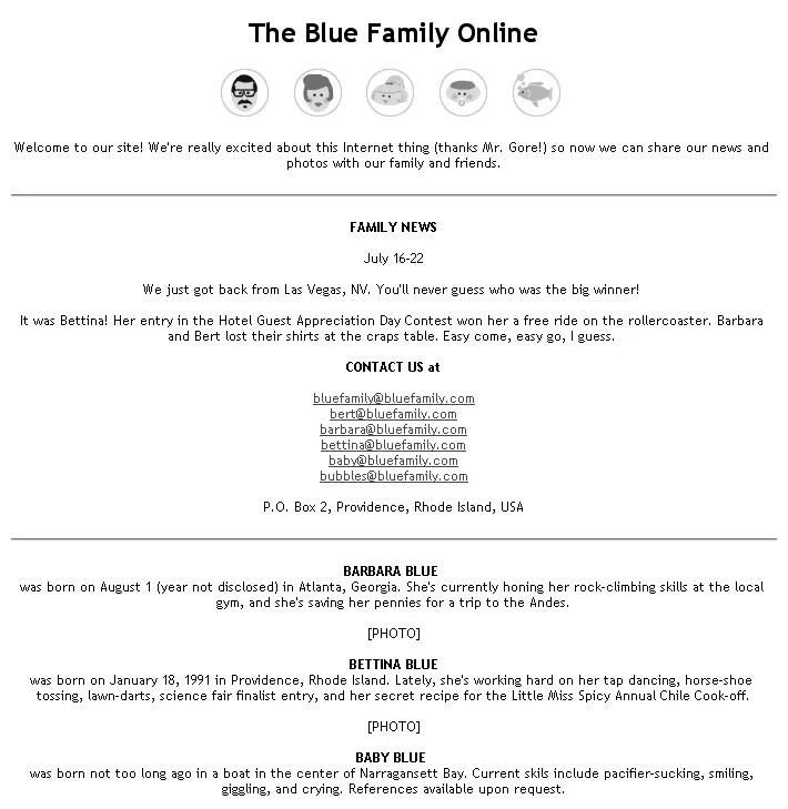
Regarding aesthetics, the way your website looks communicates a certain degree of professionalism. In other words, a chaotic and cluttered website reflects poorly on the company represented by the website. To enhance appeal, we propose that you do not center everything on the page as this makes your content difficult to read as shown in the example in figure 3. This is, however, not to be misconstrued as meaning that you should never center anything. Rather, it means that you should stick with left alignment for pages with a significant amount of content as it creates a clean first impression. Also, you should avoid mixing alignments. Lastly, you should not use too many colors.
Figure 3: Do not center everything on the page


In summary, the design and appeal of your website are important for not only attracting new potential clients but also for providing communication that converts the visitors into customers. As such, you should ensure that your website design is not only appealing regarding aesthetics but is also functional and easy to use.
- Navigation
- Brand consistency and credibility
- Trust and conversion
- Beauty and functionality
- Reading patterns and SEO
Navigation
Well-designed websites are easy to navigate, meaning that customers can easily locate content. As a general guideline, good navigation ought to be easy to locate and understand, making it easy to travel throughout the whole website. Customers often have little time to find information, meaning that ease of navigation will determine whether they continue to look through your website. In some instances, designers can be carried away with typefaces and designs. Oversimplification of interfaces optimizes the ease of use for a greater range of customers. The takeaway tip here is that your company’s website navigation ought to be so simple and intuitive that even your grandmother can understand it.Brand Consistency and Credibility
Website design is also important for your company as it is intricately attached to the consistency and credibility of your brand. According to a recent study, companies with a shoddy looking website ended up hurting their brands. A scammy-looking website has the unintended outcome of driving away customers. On the other hand, a website designed based on elegance can help potential clients connect with your branding. In essence, creative yet simple websites send the message to your clients that your brand is modern, useful and based on the needs of the consumer. If your company has a logo and if that logo is frequently used in business materials like letterheads, pamphlets, and business cards, then the logo and the associated imagery should be transferred into the website design. Your customers should be able to recognize your brand in all forms of communication.Reading Patterns and SEO
Good website design also considers the reading patterns of the target audience and considers search engine optimization, thereby expanding your company’s reach and potential customer base. Web designers consider the preferences of readers and consider them by placing the most important information in the upper left-hand column. This helps in getting the message across more effectively to visitors of your web page. Such structuring has also been shown to enhance search engine optimization.Trust and Conversion
Evidence shows that 75 percent of potential clients judge the credibility of your business based on your website design. Here, perceived credibility is an important determinant of trust, which has been shown to be an important element of customer loyalty and repeat purchase. However, while building trust among your customers is critical, such trust demands that you must first understand what your customer value. By making your company website more trustworthy and welcoming, the traffic of your website is likely to increase. To enhance conversion, make sure that the website is easy to navigate and does not waste the time of potential clients.Beauty and Functionality
Another critical contribution of properly-designed websites is functionality. Artwork can be beautiful without necessarily being functional. Professional web designers understand how to balance logic and creative thought delicately. Other professionals also provide essay writing service and could help in developing content for your website. Practical aesthetics will permit websites to transform emotional appeal into solid action. However, it should be reiterated that good website design is much more than just the visual presentation. Other important considerations include a user interface, usability and site architecture. By improving these functional elements of your website, you will likely reduce the abandon rates, improve the times spent on your website, promote referrals and improve conversions.Other Useful Tips on Dos and Don’ts
As we continue, it is important to reiterate there is no one-size-fits-all approach to designing a website. In fact, your design decision will depend mostly on the type of sites such as entertainment, e-commerce or sports. Nevertheless, you want the structuring and formatting of your website to be presentable and functional. As such, keep all file sizes as small as possible to allow quick downloads. Quick downloads will enhance the user experience. Also, you should not design your website for one specific platform, unless you are sure that your entire audience will be viewing your page under configuration. Also, do not use too many animations, especially if your page contains content you want people to read. The example in figure 1 may seem like an exaggeration, but I have seen web pages that look like this or even worse.Figure 1: An example of a page with too much animation.
You should also take the time to proofread and revise the content of your site. Proofreading is particularly important because typos and grammar errors affect your business and website badly. Use more visual weight such as color, space, and size to highlight important elements and appealingly structure your information as shown by the example in figure 2. This will allow your readers to comprehend the content just by glancing at the page, thus speeding up the process of finding what the reader needs.
Figure 2: Example from a past Webmonkey page that effectively uses treatments to express the structure of the information
Regarding aesthetics, the way your website looks communicates a certain degree of professionalism. In other words, a chaotic and cluttered website reflects poorly on the company represented by the website. To enhance appeal, we propose that you do not center everything on the page as this makes your content difficult to read as shown in the example in figure 3. This is, however, not to be misconstrued as meaning that you should never center anything. Rather, it means that you should stick with left alignment for pages with a significant amount of content as it creates a clean first impression. Also, you should avoid mixing alignments. Lastly, you should not use too many colors.
Figure 3: Do not center everything on the page
In summary, the design and appeal of your website are important for not only attracting new potential clients but also for providing communication that converts the visitors into customers. As such, you should ensure that your website design is not only appealing regarding aesthetics but is also functional and easy to use.

